![]()


|
|
|
|
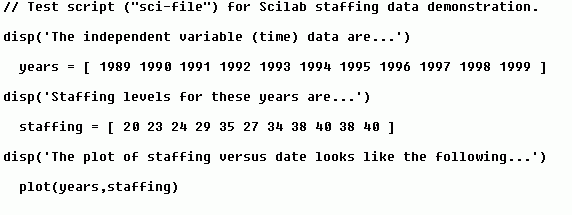
Using Scilab, Part 4: PlottingPlotting and graphical representation of data in general are strengths of Scilab. The purpose of this page is to familiarize the user with plotting using fairly simple examples. Suppose we are administrators and are given the following staffing data: Staffing Levels By Year
We can plot, say, the staffing level versus the year using
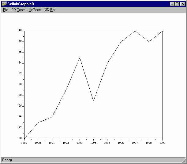
Once the script has been executed, the result is:
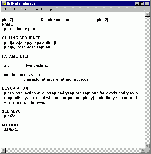
If you would like to add x-axis and y-axis labels, and a caption, check how to do it by typing "help plot" at the Scilab command prompt to see:
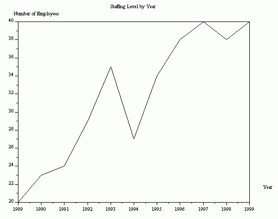
Simply follow the directions to add these features. In our example, we change the last command in the input file to look like
(the ellipsis "..." denotes a command line continuation). The result is:
|
|
This web site copyright © 1999-2000 by Robert A. Luke. All rights reserved. |